
Website recreation
for a wellness entrepreneur
I helped an entrepreneur with their website recreation, branding, and marketing. We defined their brand mission, vision, values, and value proposition. We defined their brand style, colors, typography, and visuals. I created a paper wireframe, a Figma prototype, and finally built the whole website on Wix. I helped them update and improve all the text content. I provided the customer with an asset library, and instructed them about Wix, analytics and marketing.

Project details
Pilgrim's Love
4 weeks
UX/UI Designer
Remotely

Practices
Methods & Tools
UX/UI Design, Branding, Marketing
Paper Wireframe, Figma Prototype, Material.io, Fontawesome, Wix, LinkedIn
Background
Heli is an entrepreneur who offers three different kinds of services: life coaching, animal communication, and financial administration. She is a certified LFC Life Coach, certified animal communicator and trainer, and has a degree and long experience in finance. She offers her services mainly remotely.
Heli had created her own website for her company on her own to Wix, with the idea as long as there is a website and it works. With the help of Wix’s suggestions, she had managed to choose some colors and fonts, which she thought looked nice. She managed to somehow add the services, introduction, and buttons for sending emails and ordering through that. However, in the mobile view there were problems, only half of the buttons were visible, but she was not able to fix it, and since they worked, she let it be, thinking it’s not that big of a deal. She showed me the new website, and offered her my help to make them more user friendly.
The objective of the project was to define her brand and recreate her website to better represent her company, and to improve her marketing and reach her target audience. The meetings were held in Google Meets. We would work on different things together during the meetings, as well as separately on agreed tasks in between the meetings.
Below you can see a video of how the website looked like before.
Quick Navigation
Creating the assets, wireframes and prototype
We began the project by discussing the current situation of the website and the needs for the new version. We agreed on the brand colors, fonts, and elements - what to keep, what to change, what to add. Heli liked the color scheme, fonts, and logo she had used and wanted to continue with them. We agreed what content should be included in the new version, such as adding a dedicated Services page for her offering, and adding customer references she had received and collected. I explained to her my vision of what content would be on each page, in what order, and so on and Heli liked it.
For the next meeting we agreed that Heli would think about options for her main headline on the front page, look for better pictures to be used, gather the customer feedback together, and create a Drive folder for the materials, easy for me to access. Meanwhile I would find her a color palette based on her desired scheme, and work on the wireframe and prototype.
I started by creating the asset library on Figma - the logos, typography, colors, menus, buttons, cards, and icons. I used the Material.io tool for choosing the colors and Fontawesome for the icons. Once the asset library was done, I showed it to Heli to get her approval. I made it as simple and clear as possible, so she would be able to refer back to it and use it in the future as well.


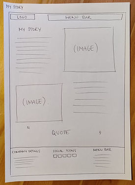
After getting approval on the assets, I started working on a sitemap and content map, but as the website structure is so simple, I quickly saw it made no sense to make them, and deleted the sketches. Instead, I created paper wireframes for each page of the website, based on our earlier discussions of my vision. I showed them to Heli, making sure if there were any needs for changes, before continuing to build the prototype on Figma. Everything was good and she also sent me the Drive folder with the materials I asked for.


Next I created the layout for the five pages on Figma, adding the right elements, pictures, logos, typography, colors and buttons. I didn’t add the text content yet, as we needed to work on improving them together, I just had “Main title here” and “Services description here” and so on, in the correct places.
In the next meeting, I showed the prototype to Heli and she liked it. Together we worked on the text content for the front page - we created the titles and subtitles, her short introduction, and short service descriptions for the three main categories. We also defined her mission and value proposition.
The core of her business is all about people and humanity, so the two titles in the front page say “So everyone could be themselves” and “From one human being to another”. This is what she is all about. She wants to help people through her life coaching, so everyone could be themselves. She also wants to help people to understand their pets better, and this way helps the owners and the pets to be themselves. In the center of everything is humanity - we are all valuable, lovable, precious. No one is above others.


I needed some more pictures and we agreed Heli would look for them and add them to the same Drive folder with the others. We also agreed that for the next meeting, she would work on her story based on some instructions I gave her, on what she should include. She would work on defining her vision, and a quote to be used in her Story page, to reflect her and her business. Heli was also going to take new pictures of herself in the near future and we agreed what they should be like to fit the now defined brand look. I would work on the service product descriptions and references.
I first added the customer references: the ones related to her work to the Services page under the service offerings, and the ones related to her more as a coach and a person, to her Story page below her story and quote.
Then I created the service descriptions based on her old materials. I divided her products under two main categories: coaching and animal communication. Her financial services did not have specific products, they were explained in the service offering and it was enough.
The old product descriptions were too long and had unnecessary details, they should be kept short and concise. I included only the titles, a short description of what it is about, how it is executed, and the price. Each product had a button to the contact page, where the viewer could decide their preferred contact method.
Two of the coaching products were originally combined together. They could be purchased together or separate, but it was confusing for the reader so I separated them for clarity and added clear descriptions for each. I also created a new product for the company coachings, as before it was just a mentioning along the text. This is for clarity, all products in the same place, as their own product, with their own information and details.


In the next meeting I showed Heli what was new in the prototype and she was happy with what I had created. We continued to work on the Story page and Heli gave me two different versions of her story I asked her to write, and I chose the better one and explained to her why. I also told her how she could utilize the other version in her blog posts and marketing, targeting different customer groups and needs with them. Heli gave me options for the quote I asked for, and I combined the different versions together for the best result. Finally, we ideated and and chose the headline for the main blog page.
We agreed I would next work on building the new website on Wix based on this prototype, and fix her SEO settings as well to fit the new website. Once I was done, we would have the next meeting to check everything out and get her final approval before publishing. I would also consult her a bit about how to use Wix, how to follow and analyze the marketing analytics, what they mean, and give some tips for how to implement marketing in the future, following the newly established brand.
Below you can see a view of the whole prototype on Figma. Everything else is detailed and ready, except for the contact form and the blog post previews. There was no need to spend time on making them more detailed here. The idea for the Blog was already shown in the paper wireframe, and the form would be minimalistic, with only necessary fields.

Building the website
I started building the website on Wix in the order of the pages in the menu: Front page, Services, Story, Contact, and Blog. I created the Front page in desktop and mobile view, and started working on the Services page desktop view.

Learning point
While I was working on the Services page, I had accidentally pressed something on Figma, which had made the prototype look completely weird. I had to ask for help from our company’s more experienced UX designer, who taught me the basics of Figma last year while I was studying UX/UI design. He helped me out and at the same time saw my prototype. He told me it looks very professional and nice, but also noticed some improvement points.
He helped me get a color I asked using the color picker tool, and told me the Assets need to be made into components, so when you make change to an asset, it changes everywhere it is used, and thus saves time. So to learn to do it right from the beginning, I added the typography and colors for primary, secondary, accent, headlines, and body, and then chose the right ones throughout the prototype. I added secondary text color, as he reminded me there is hierarchy through those as well. This project was my first customer project since expanding my designer skill set with UX/UI design, so it was only natural I did not remember it all just yet.


After fixing the assets and making changes to the prototype, I continued building the website on Wix by creating the Services page and its products. At first I saved all the elements to be used from Figma as they were, with rounded corners, but on Wix they worked differently, the ratios worked differently and made the elements different sizes. So I saved them with normal corners, played around with the settings on Wix to get the same effect, and learned a lot of new things while doing so. It’s good to make mistakes, they teach you so much when trying to find a way to solve things in a different way.
When working on the website, I noticed that the same typography sizes did not work after all, they were too big due to the tablet optimization. I made the typography sizes smaller and made the changes to the asset library in Figma, which I would give to the customer as guidelines for the future. I did set up everything ready on Wix, but the asset library would still be useful for the customer. As end results often change after the final prototype, I did not make the changes to the prototype itself.
Once the desktop view of the Services page was ready, it was time for the mobile view. The mobile view needed to be more simplified, the pink cards with the product descriptions and customer feedback did not work, so I hid them on the mobile view. The end result looked really nice and fresh.
Next up was the Story page, which was simple and easy to make both on desktop and mobile view. Wix now automatically hid the pink cards on the mobile version, so it was easy to fine tune after doing the desktop view first. Below the both customer feedback sections on Story and Services, there are buttons that link to each other, to show more feedback for the customers. This is because people navigate on websites differently, and we want to guide them around no matter what kind of user flow they are having. I put anchors to both feedback sections, so when the customer clicks the button, it takes them directly to the right section, instead of having to scroll down the page. Lastly, I did the Contact page and Blog page in both desktop and mobile view. In one day, I had built the whole website on Wix, based on the prototype. This is how easy it is, once the groundwork is done well.
Finalizing the website
Finally, it was time to finalize the website. I added an Error 404 page and carefully went through the whole website again, proofreading and checking everything out once more. I checked all the buttons so they work and take to the right place, and change color when hovered to indicate action to the user. I looked through the website and its scalability with a laptop screen, a big 27” screen, and with mobile, to see everything works as they should and looks great no matter what device or screen you are using.
Heli had chosen a multilingual page to begin with, but it was hard for her to use it and it, and it did not work well. She had tried to do it herself, but did not manage. It was a common situation where the platform suggests you all kinds of things when you begin to use it and build the website. Without knowledge you take them and in the end, it just makes everything more confusing and difficult. So I took the feature away and kept it in the original language only. This makes the managing of the website easier for Heli. I told her there are other ways to implement multiple languages in her website, which I would help with when the time was right.
After making sure everything was good, I published the website and fixed the SEO settings. I changed the keywords for better ones, to help people find the website. Heli had issues with people finding the website on Google Search and I could see why. I added more common keywords people search with and gave the option to find the website even with incorrect writing. I also updated the headline to a more descriptive and general one, since people are searching for coaching and not so much for specific coaching certificates. All this increases the number of people finding her. I also changed the descriptions of each page so it's more explaining and selling when viewing on Google search results. Previously when Googling her company’s name, she wasn’t on the first pages. Now her Facebook page and website were the top two organic search results. Small changes can give you big results.

Design handoff
In our last meeting, I showed Heli the new published website. I showed her around her website on Wix, how to manage different things, and how things work. I showed the set theme colors and typography, where the pictures, icons and other assets are, and sent her the asset library I created with Figma. I showed Heli the new SEO settings and changes. We changed one keyword from personal coaching to pilgrims, since she had insight that many people search with only the first part of her company’s name, when they don’t remember the whole name. Google had not yet updated the new changes to the search results, such as the meta descriptions, but it always takes a while.
I showed Heli the marketing analytics on Wix, explained what each means, and what she should keep an eye on to see how her new site is performing. We discussed her LinkedIn profile and marketing, and I advised her on how to improve her profile to better reach her goals and serve her customers. I advised her about marketing, what kind of content she should create, and the importance of consistency with the newly defined brand across different channels. Lastly, I told Heli she needs a privacy statement, and gave her some links to learn from, and agreed I could help them set up the privacy settings bar once they had the document to link to it.
Below is a video of the final product.
Customer feedback

With Minka's help, I got a beautiful and wonderfully functional website, where customers can find the information they need easily and effortlessly. With her fantastic professionalism and visual vision, Minka built the website to reflect my business exactly as it is. With the help of Minka's visuality, it was easy to find suitable features, such as the company's brand and the colors, fonts and images that match it.
Making the site with Minka was pleasant and clear, and she is an incredibly efficient professional with a huge amount of information about everything and she finds solutions to every issue. My part in the collaboration was clear, to choose image options and write the texts, and Minka chose the ones suitable for the site and guided the content of writing the texts, clearly stating the points that should be included in them.
I recommend Minka with all my heart, with her you don't have to wonder about things, instead websites, productization, and branding are carried out smoothly, and with a professional touch, she sees the whole thing from an entrepreneur's point of view.
Heli Heininen, Entrepreneur, Pilgrim’s Love
See my other customer cases


